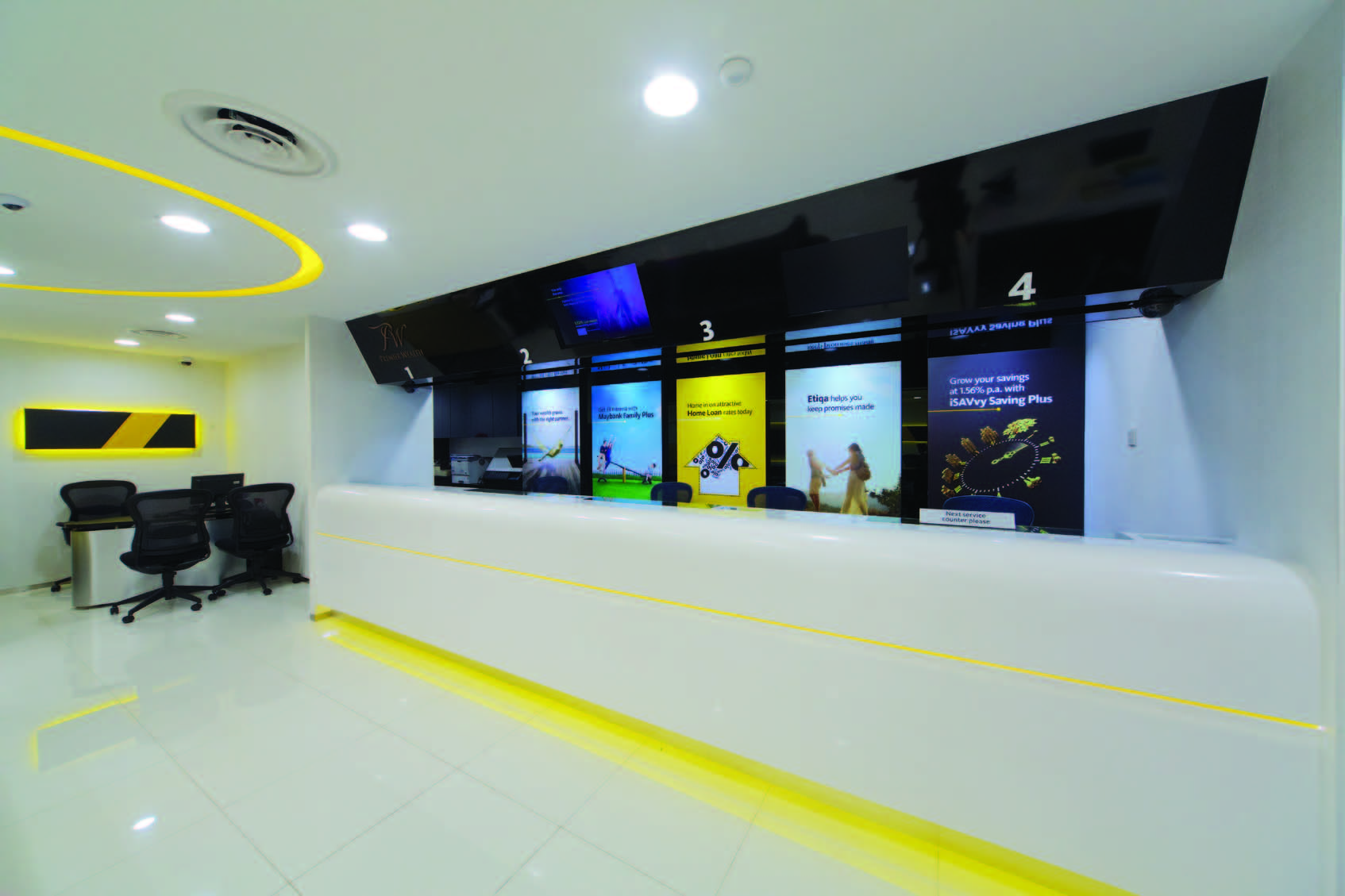
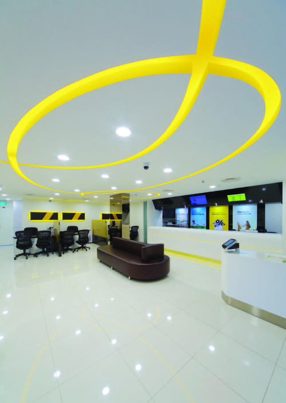
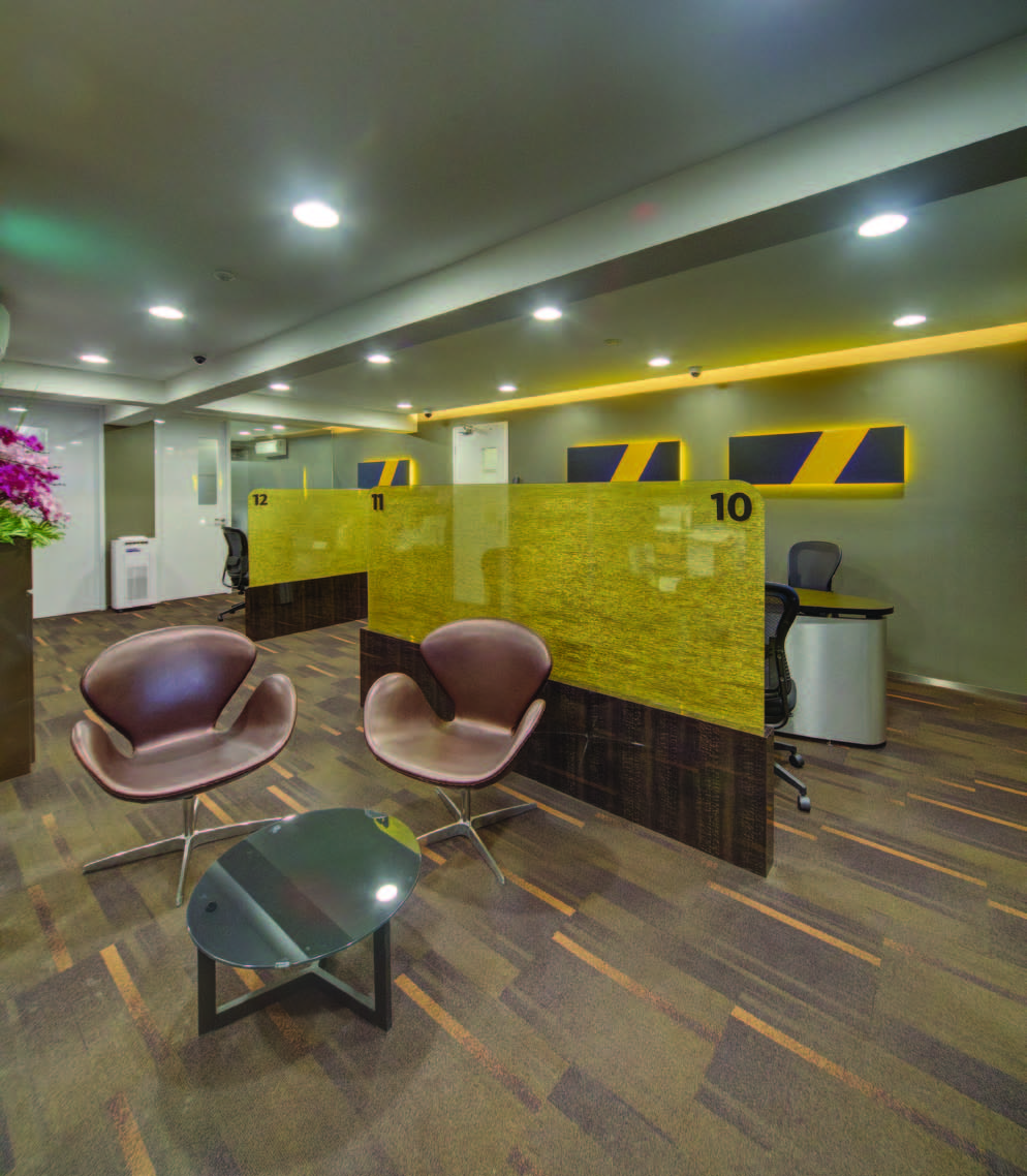
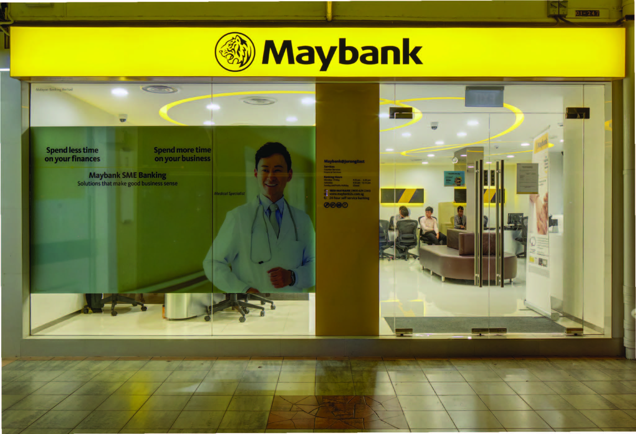
We have designed and built many branches for the bank in Singapore and overseas. Each requires us to translate Maybank’s corporate identity into a consistent and engaging spatial environment. Key to our design is a strategic use of the brand’s black and yellow colours to guide users in and around the retail branch. Yellow is used to accentuate the bank’s different areas, including an iconic counter designed to maximise space for marketing. Stitching all the spaces together is a fluid yellow light on the ceiling, inviting customers in to experience Maybank.
“We would like to express our appreciation to Mr Alexis Yeong and all other team members who were involved in the project. They were creative in coming up with their design concepts for the branch, taking into consideration and complying with our Head office Transformation guidelines. They were committed and spent considerable effort working closely with our team to achieve the project completion timeline within our limited budget.”
—Kenneth Tan, Head, Property Management


